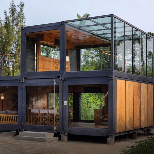
Design Flexibility: Customization Meets Creativity in Modern Design Solutions
Have you ever stared at a blank canvas or a rigid template, feeling the weight of limitations pressing down on your creativity? Design flexibility is the game-changer that turns those constraints into opportunities. It’s where customization doesn’t just meet creativity—it dances with it, creating solutions that are as unique as the problems they solve. Whether you’re designing a website, a product, or even a living space, the ability to adapt and personalize is what separates forgettable designs from unforgettable ones.
Interestingly enough, the most innovative designs often emerge from the tension between structure and freedom. Too much rigidity stifles creativity, while too little direction can lead to chaos. The sweet spot? A framework that embraces design flexibility, allowing for customization without sacrificing coherence. In this article, we’ll explore how this balance is achieved, why it matters, and how you can apply it to your own projects.

The Philosophy Behind Design Flexibility
At its core, design flexibility is about creating systems that can evolve. It’s not just about making something "customizable" in the traditional sense—it’s about building adaptability into the DNA of a design. Think of it like a Lego set: the pieces are standardized, but the possibilities are endless. This philosophy is rooted in a few key principles:
- Modularity: Breaking designs into interchangeable components that can be rearranged or replaced.
- Scalability: Ensuring designs can grow or shrink without losing their essence.
- User-Centricity: Prioritizing the needs and preferences of the end-user over rigid aesthetics.
- Iterative Thinking: Embracing the idea that designs are never truly "finished"—they’re always evolving.
Frankly speaking, this approach challenges the traditional notion of design as a static, one-size-fits-all solution. Instead, it treats design as a living, breathing entity that responds to context, culture, and individuality. For example, a modular furniture system like IKEA’s SEKTION kitchen cabinets allows homeowners to mix and match components to fit their space and style. It’s not just about selling cabinets—it’s about selling the freedom to create a kitchen that feels uniquely yours.
Why Flexibility Matters in Today’s Design Landscape
In a world where personalization is king, rigid designs are quickly becoming relics of the past. Consumers don’t just want products—they want experiences tailored to their needs. This shift is evident across industries:
- Digital Design: Websites and apps now offer customizable dashboards, themes, and layouts to enhance user engagement.
- Product Design: From Nike’s customizable sneakers to Tesla’s over-the-air software updates, products are designed to adapt to their users.
- Architecture: Adaptive reuse projects transform old buildings into modern spaces, preserving history while meeting contemporary needs.
It’s worth noting that design flexibility isn’t just a trend—it’s a response to the growing demand for individuality. When users feel like a design was made *for them*, they’re more likely to engage with it, advocate for it, and even pay a premium for it. To be honest, this is why brands like Apple and Spotify invest heavily in customizable interfaces. They understand that personalization fosters loyalty.
How to Achieve Design Flexibility Without Losing Your Vision
So, how do you strike the balance between structure and freedom? How do you ensure that customization meets creativity without descending into chaos? Here are some practical strategies:
1. Start with a Strong Foundation
Flexibility doesn’t mean starting from scratch every time. In fact, the most adaptable designs begin with a solid framework. Think of it like a tree: the trunk provides stability, while the branches can grow in countless directions. For designers, this might mean establishing a set of design principles, a consistent color palette, or a modular grid system. These elements act as guardrails, ensuring that customization enhances rather than detracts from the overall vision.
For example, Google’s Material Design system is built on a foundation of motion, depth, and hierarchy. While the system allows for extensive customization, it ensures that all variations adhere to core principles of usability and aesthetics. This approach gives designers the freedom to innovate without reinventing the wheel.
2. Embrace Constraints as Creative Catalysts
Constraints aren’t the enemy of creativity—they’re its fuel. When you’re working within limits, you’re forced to think outside the box. This is where design flexibility truly shines. For instance, a designer working with a limited color palette might explore texture, typography, or negative space to create visual interest. Similarly, a product designer constrained by manufacturing limitations might discover innovative ways to use materials or assembly techniques.
Interestingly enough, some of the most iconic designs in history emerged from constraints. The iPod’s click wheel, for example, was born out of the need to navigate a vast music library with a single hand. The constraint of limited physical space led to a solution that was both functional and revolutionary.
3. Prioritize User Feedback and Iteration
Flexibility isn’t just about what you *can* change—it’s about what you *should* change. This is where user feedback becomes invaluable. By testing designs with real users, you can identify pain points, preferences, and opportunities for customization. Tools like A/B testing, heatmaps, and user surveys can provide data-driven insights that inform iterative improvements.
Many experts agree that the best designs are never truly "finished." They evolve based on user behavior and technological advancements. Take Netflix’s interface, for example. The platform constantly tweaks its recommendation algorithms and layout based on user interactions. This iterative approach ensures that the design remains relevant and engaging, even as user preferences shift.
Real-World Examples of Design Flexibility in Action
To truly understand the power of design flexibility, let’s look at some real-world examples where customization and creativity intersect to create something extraordinary.
1. LEGO: The Ultimate Modular System
LEGO is the poster child for design flexibility. With just a handful of basic brick shapes, the possibilities are endless. Whether you’re building a castle, a spaceship, or a replica of the Eiffel Tower, LEGO’s modular system allows for infinite customization. What’s more, the company has expanded its offerings to include themed sets, customizable minifigures, and even digital design tools like LEGO Digital Designer.
This approach has made LEGO a beloved brand across generations. It’s not just a toy—it’s a platform for creativity, problem-solving, and self-expression. As one LEGO designer put it, "We don’t sell bricks. We sell the joy of creation."
2. WordPress: Empowering Digital Creativity
WordPress is another prime example of how customization meets creativity. With thousands of themes, plugins, and customization options, WordPress allows users to create everything from simple blogs to complex e-commerce sites. The platform’s open-source nature means that developers can tweak, modify, and extend its functionality to suit their needs.
What makes WordPress so powerful is its balance of structure and flexibility. Users can choose from pre-designed templates or build their own from scratch. They can add functionality with plugins or write custom code. This adaptability has made WordPress the backbone of over 40% of all websites on the internet.
3. Tesla: Redefining Product Customization
Tesla has taken design flexibility to the next level by integrating software and hardware in ways that allow for continuous customization. Unlike traditional cars, which are static once they leave the factory, Tesla vehicles receive regular over-the-air updates that add new features, improve performance, and even change the user interface.
For example, Tesla’s Autopilot system evolves with each software update, adding new capabilities like automatic lane changes and traffic-aware cruise control. Owners can also customize their vehicle’s settings, from the acceleration profile to the ambient lighting. This level of adaptability ensures that a Tesla feels like a "new" car long after it’s been purchased.
The Future of Design Flexibility: Trends to Watch
As technology advances, so too does the potential for design flexibility. Here are some trends that are shaping the future of customizable design:
1. AI-Powered Personalization
Artificial intelligence is making it easier than ever to create personalized experiences. From AI-generated design recommendations to dynamic content that adapts to user behavior, AI is enabling a new level of customization meets creativity. For example, platforms like Canva use AI to suggest design elements based on user preferences, while apps like Spotify curate playlists tailored to individual tastes.
The key here is balance. While AI can automate customization, it’s important to ensure that designs still feel human and authentic. After all, no one wants to feel like they’re interacting with a robot.
2. Sustainable and Adaptive Design
Sustainability is no longer just a buzzword—it’s a design imperative. Flexible designs that can be reused, repurposed, or recycled are becoming increasingly important. For example, modular clothing allows users to mix and match pieces to create new outfits, reducing the need for fast fashion. Similarly, adaptive architecture designs buildings that can be reconfigured for different uses, extending their lifespan.
This trend is a win-win: it reduces waste while giving users more control over their environment. Have you ever wondered how much more sustainable our world could be if every product was designed with adaptability in mind?
3. The Rise of No-Code and Low-Code Tools
No-code and low-code platforms are democratizing design, allowing non-experts to create custom solutions without writing a single line of code. Tools like Webflow, Bubble, and Figma empower users to build websites, apps, and digital experiences tailored to their needs. This shift is making design flexibility accessible to everyone, not just professional designers.
The implications are huge. Small businesses can create custom e-commerce sites without hiring a developer. Educators can design interactive learning experiences without coding skills. The barrier to entry for creativity is lower than ever before.

Putting It All Together: How to Apply Design Flexibility to Your Projects
Now that we’ve explored the what, why, and how of design flexibility, it’s time to put these ideas into practice. Here’s a step-by-step guide to integrating customization and creativity into your next project:
1. Define Your Core Objectives
Before diving into customization, ask yourself: What problem are you trying to solve? Who is your audience? What are their needs and preferences? By answering these questions, you can create a design that is both flexible and purposeful.
For example, if you’re designing a mobile app, your core objectives might include ease of use, personalization, and scalability. These goals will guide your decisions as you build out the app’s features and interface.
2. Build a Modular Framework
Break your design into modular components that can be mixed, matched, or modified. This could mean creating a library of reusable UI elements, designing a product with interchangeable parts, or developing a content management system that allows for easy updates.
The key is to ensure that each module is self-contained and can function independently. This makes it easier to swap out components without disrupting the entire system.
3. Test, Iterate, and Refine
Flexibility isn’t a one-time effort—it’s an ongoing process. Test your design with real users, gather feedback, and iterate based on their input. Tools like UserTesting and Hotjar can provide valuable insights into how people interact with your design.
Remember, the goal is to create a design that evolves with its users. Don’t be afraid to make changes, even after launch. As the saying goes, "Design is never done."
4. Empower Your Users
Finally, give your users the tools they need to customize their experience. This could mean offering a range of themes, providing a drag-and-drop editor, or allowing for third-party integrations. The more control users have, the more invested they’ll be in your design.
For example, Notion allows users to create custom workspaces by mixing and matching templates, databases, and integrations. This level of flexibility has made Notion a favorite among productivity enthusiasts, as it adapts to each user’s unique workflow.
So, where will you start? Will you redesign your website with modular components? Create a product that adapts to user preferences? Or perhaps explore no-code tools to bring your ideas to life? The possibilities are endless when design flexibility is your guiding principle.
For more detailed information, please visit our official website:Design Flexibility: Customization Meets Creativity
About the author: Emily Carter is a design strategist and innovation consultant with over a decade of experience bridging creativity and customization. Specializing in user-centric design, she helps brands transform rigid frameworks into adaptable, engaging experiences. Emily’s work has been featured in *Design Week* and *Creative Review*, and she regularly speaks at industry conferences on the future of flexible design. When she’s not designing, you can find her experimenting with modular furniture or exploring the intersection of art and technology.


